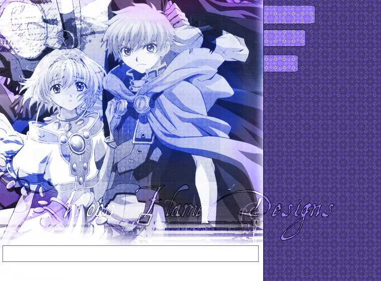
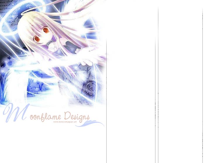
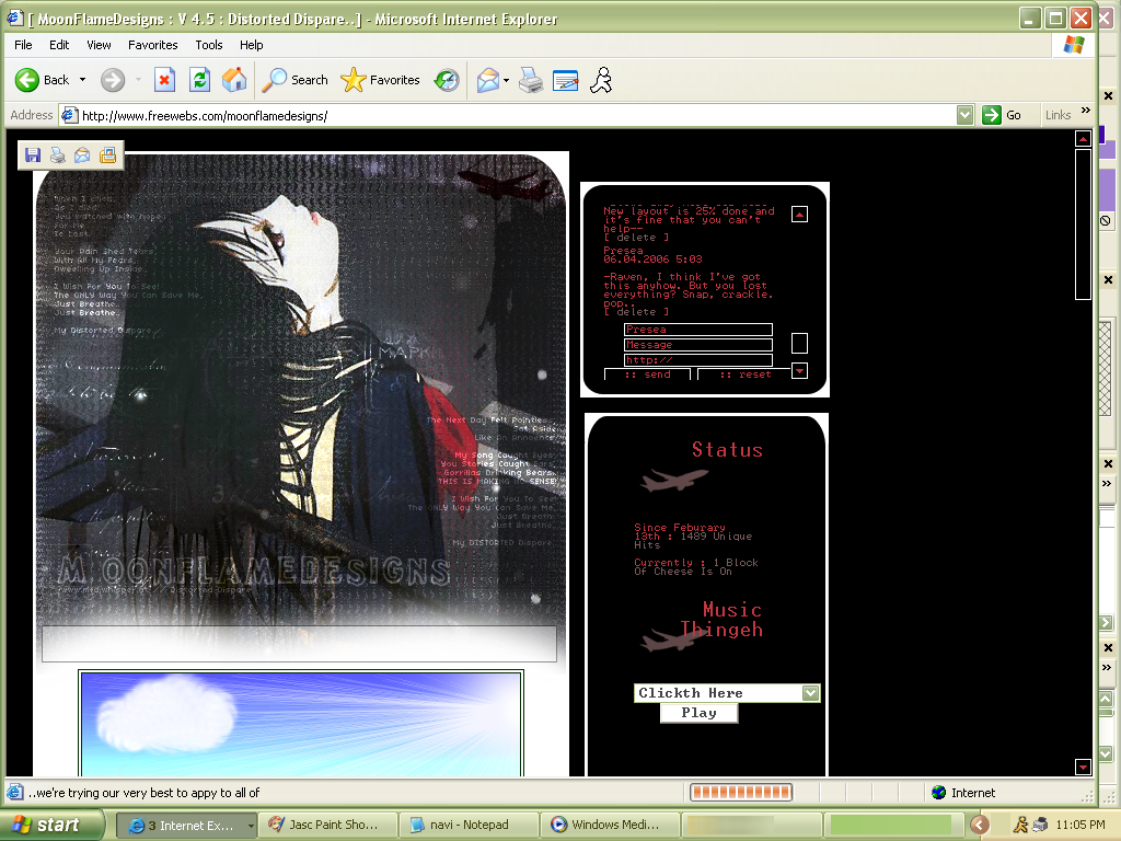
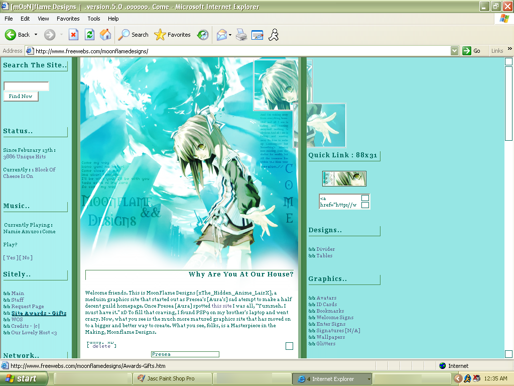
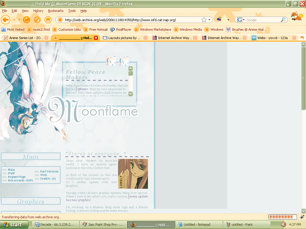
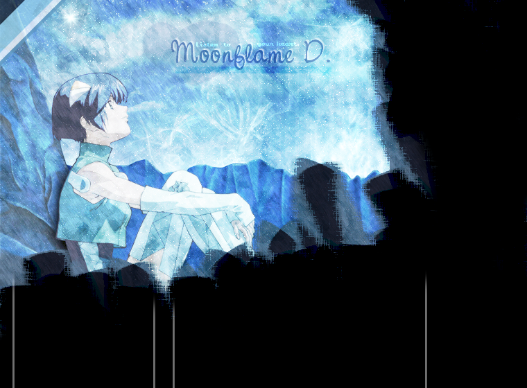
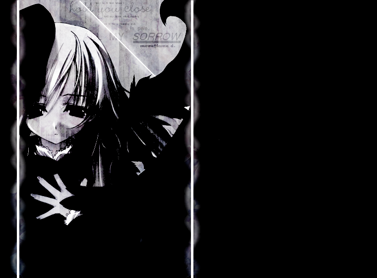
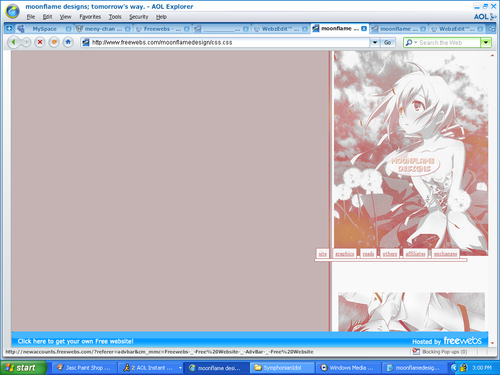
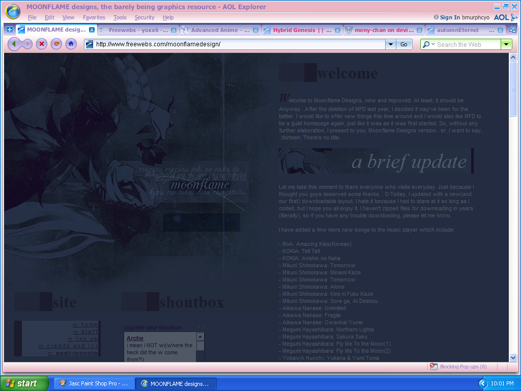
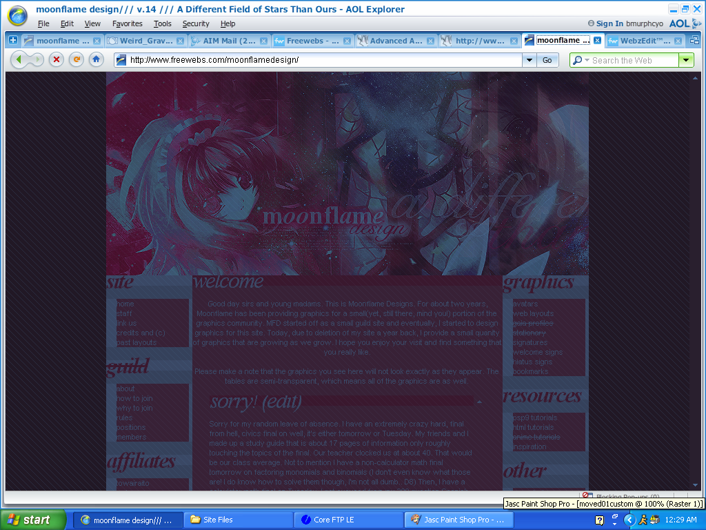
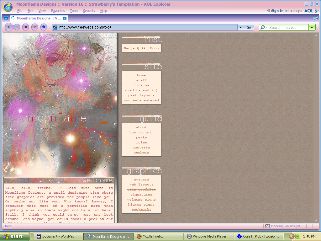
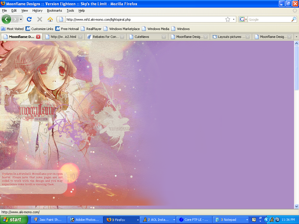
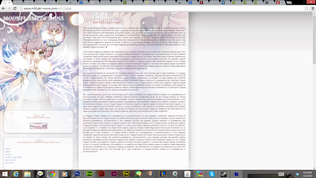
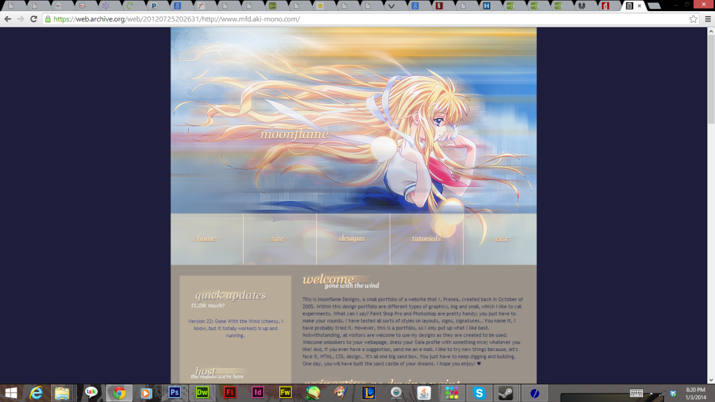
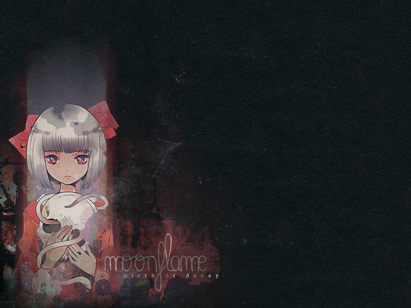
welcome
Ello, ello, friend. (: This site here is Moonflame Designs, a small designing site where free graphics are provided for people like you. Or maybe not like you. Who knows? Anyway, I consider this more of a portfolio more than anything else so there might not be a lot here. Still, I think you could enjoy just one look around. And maybe, you could sneak a peek at our affiliates, as well. (: They're just as great as I, if not better. Enjoy the rest of your morning/evening/night/day!
shoutbox

ShoutMix chat widget


Past Layouts
Well, before when Moonflame was just an itsy, bitsy little website that I thought was the cooliest around ('cause I thought I was the cooliest around, how naive..) we had many, many, not so fabulous layouts! I count all of those layouts as Version 1 of Moonflame (mainly because I don't have their screen capture or anything from them. Oh, and we used premades and stuff). All of our other versions, which believe it or not, improved over time follow this paragraph here. These layouts are for viewing purposes only. D: You can click on the little pictures to see bigger pictures.


V.2: Protect Me*

I was very proud of this layout at the time I had made it. It was my first ever(successful) custom layout for Moonflame Designs as we before used premades and pieces of crap I would've, at that time, called genius. Whatever. (xD) I can't say that I still love this layout, but I know it was a great accomplishment for MFD.


V.3: Untitled(1)*

Yes, this one never really had a name (or, not one I can remember). I designed Untitled(1) on my brother's laptop and eventually transferred it to my PC for the big finish. I was also proud of this one a while back. I still kind of like the simplicity of it.


V.4: Distorted Dispear

This was definatly one of my favourites from when I was still a newbie! I was so happy I was able to throw those planes in with my headers, although they had nothing to do with the actual main image. I really loved the scheme of this layout. However, this layout disappoints me as it shows how badly I spelled when I was eleven (notice title on screen capture).


V.5: Come

Another one of my favourites! And surprisingly enough, a lot of our visitors really liked this one, too. I was in love with the hover effect I used (drop shadow) and we even had music you could turn on or off. This layout made me so very proud. I still really like this one.


V.6: Magic

I started to design a bit different by the time this layout came around. To me, this layout was another big accomplishment for MFD. I like the way I designed this one very much. I especially loved the little box behind our title (although I don't know why).


V.7: Untitled(2)*

This layout was our final layout with freewebs.** It was kind of plain, but overall, I really loved the turnout. Surprisingly, flipping the main image vertically added a unique touch and didn't turn out so bad. I guess I can say that I liked this layout.


V.8: Listen to Your Heart*

YUCK. I hated this layout so much! I shamed Scheris' pretty face so badly with this one! I believe I just got done watching the series s-CRY-ed, so I wanted to use an image from that anime (since it moved me so much). We were just accepted by Jenni, our former host, to be hosted under her domain and she wanted me to make a new layout. I procrastinated and came out with this. Dx


V.9: Sorrow*

I loved this layout. To this day it is still a huge favourite for me. Every element fit perfectly. There was not one image out of place. The dark simplicity is something else I loved about this layout, but I really think that the main image made it all.


V.10: Spring Is Here

A favourite of many and myself as well. Well, for a little bit after I made it anyone. Once again, I started designing differently and this was the layout that launched it all. We had just hired(hired? xD) Amy and she helped me code the navigation for this layout. I think it turned out splendid.


V.11: Diary of an Angel*

T____T I loved this layout sooooo much! But, our site got deleted when it was up and I didn't even get a screen capture of it! It was so pretty (after I had fixed all the mistakes). It was simple yet detailed at the same time. I only wish I could've had it up a bit longer. :'c


V.12: Tomorrow's Way

I know I've said this too much, but I loved this layout. This layout picked MFD up off the ground after the deletion and although it was very simple, the main image made it shine ever so brightly. It was inspired by Yui's song, "Tomorrow's Way," and was very pretty. Although, I think I made this one a bit too narrow. D:


V.13: Untitled(3)

I suggest you look at the screen capture if you would like to actually see this layout. It was so dark, you can barely make out the preview. Well, I think this is one of my favourite layouts of all time. This and the one following it. It was dark but it was stunning and I think the coding made up for anything the layout was lacking. This is when MFD gained back 1/4 of it's visitors. (x Pretty layout, in my opinion.


V.14: A Different Field of Stars Than Ours

Oh, this layout~ I still love it. *w* It was so pretty and organized. Moonflame's first successful table layout, in fact. I loved the main image, too. I started designing differently again, using A LOT of stock. This one had a lot of blended star fields, hence the title. The only reason I ever took this layout down was because it was really dark. I wanted to make something light next. Otherwise, this layout would still be up. x3


*I was unable to find screen captures of these layouts therefore only their top images are available for viewing.

**That's a lie. We had another layout after this one, but somehow it didn't fit in (version wise). And I can't find the main image. I remember it, however. Very beautiful. Another black and white layout. The image blended ever so nicely with the background. It was our layout after our revamp (which one? We've had too many xD).

Credits
© Presea; September 5th-6th, 2008 DO NOT REPRODUCE WITHOUT PERMISSION. Pattern: Shizoo. Textures: Feel. Images © Respective Owners.